Website design and UX development for the best in AR Automation out of Munich, Germany.
Bilendo has been a long time receiver of Square Dot creativity. With full website redsigns, rebuilds, marketing material and user experience design for the frontend, we're passionate about bringing better work experiences to enterprises who use the software.
Great times integrating with the exisiting and growing team at Bilendo!
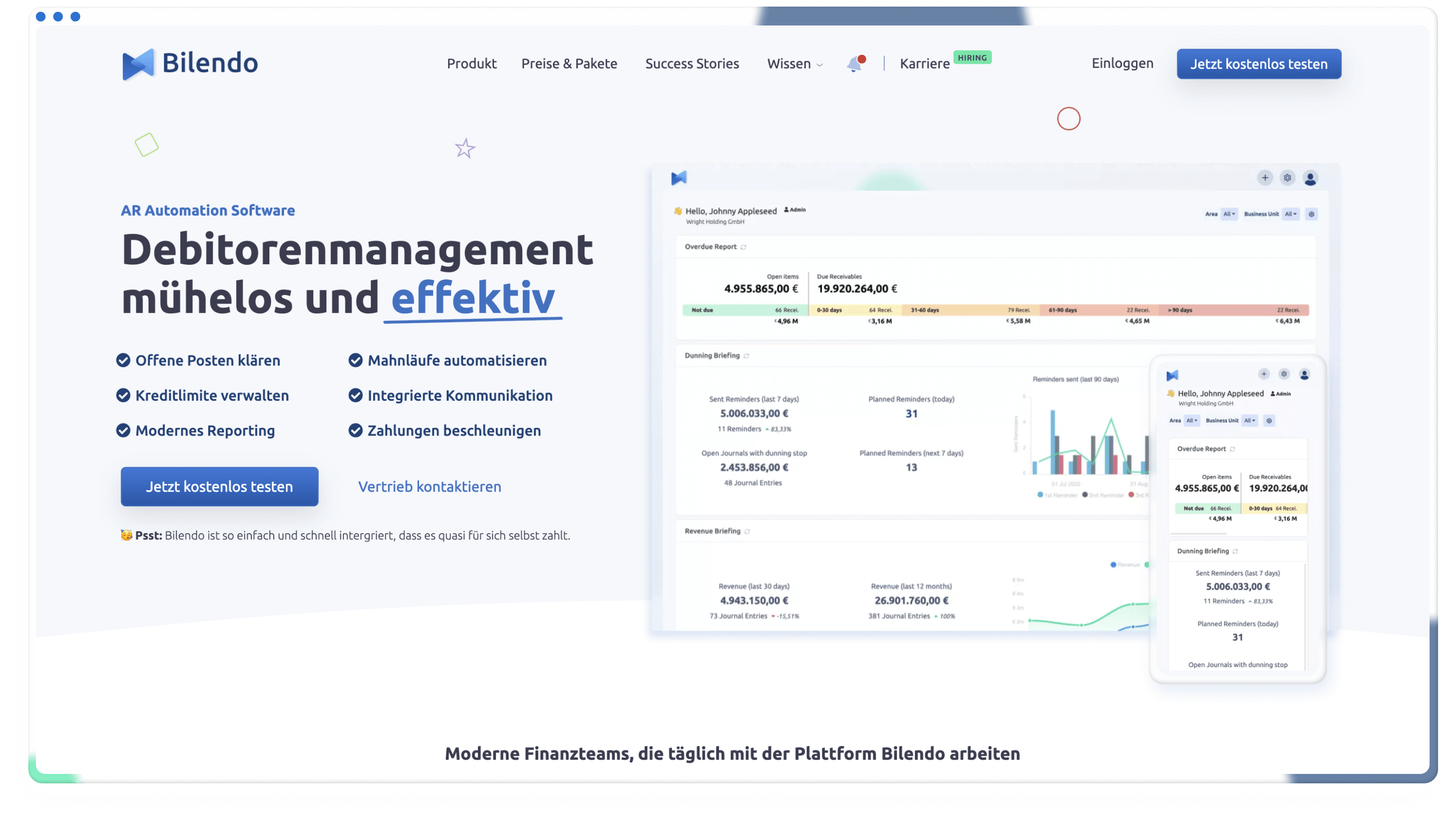
Clean layout
For a complex topic, we wanted to showcase a clean and clear layout that embraced what the software feels like - industry leading.
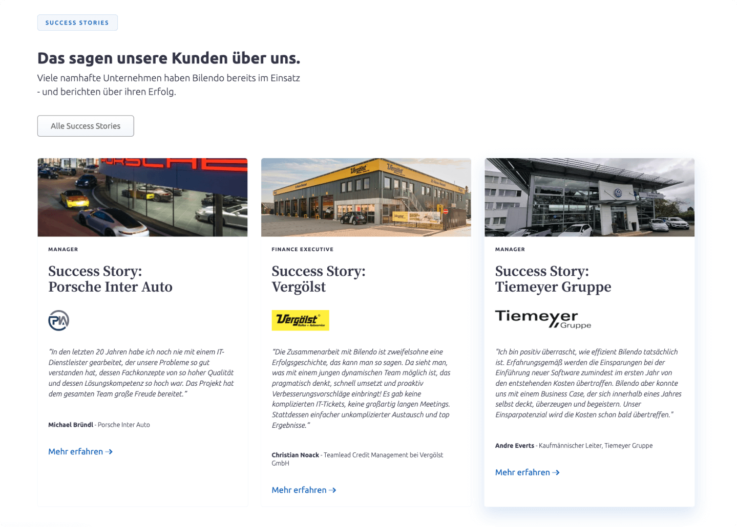
Comparisons
Creatively displying the difference between working without Bilendo and with Bilendo. Adding user engagement with a toggle to show the change on the page.
Without Bilendo
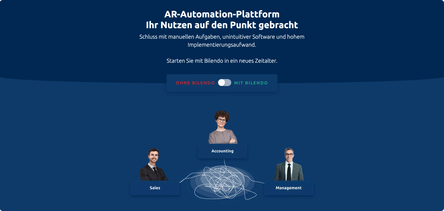
With Bilendo
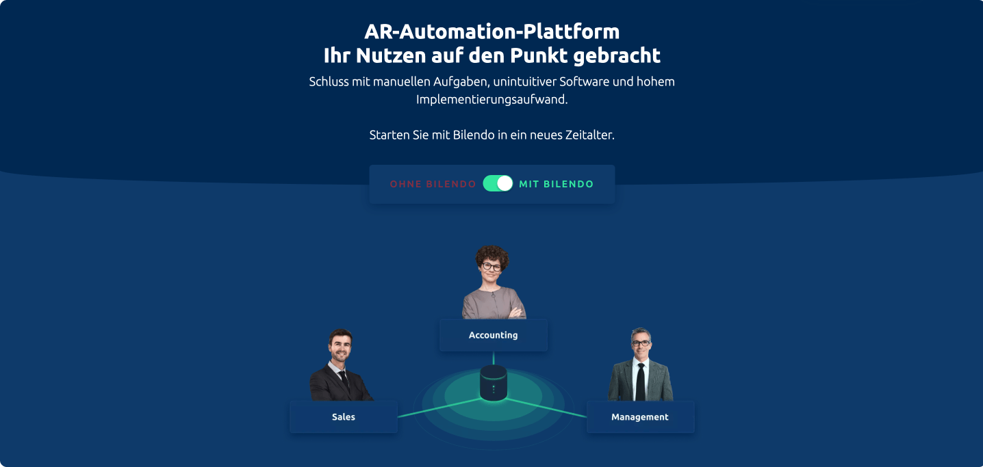
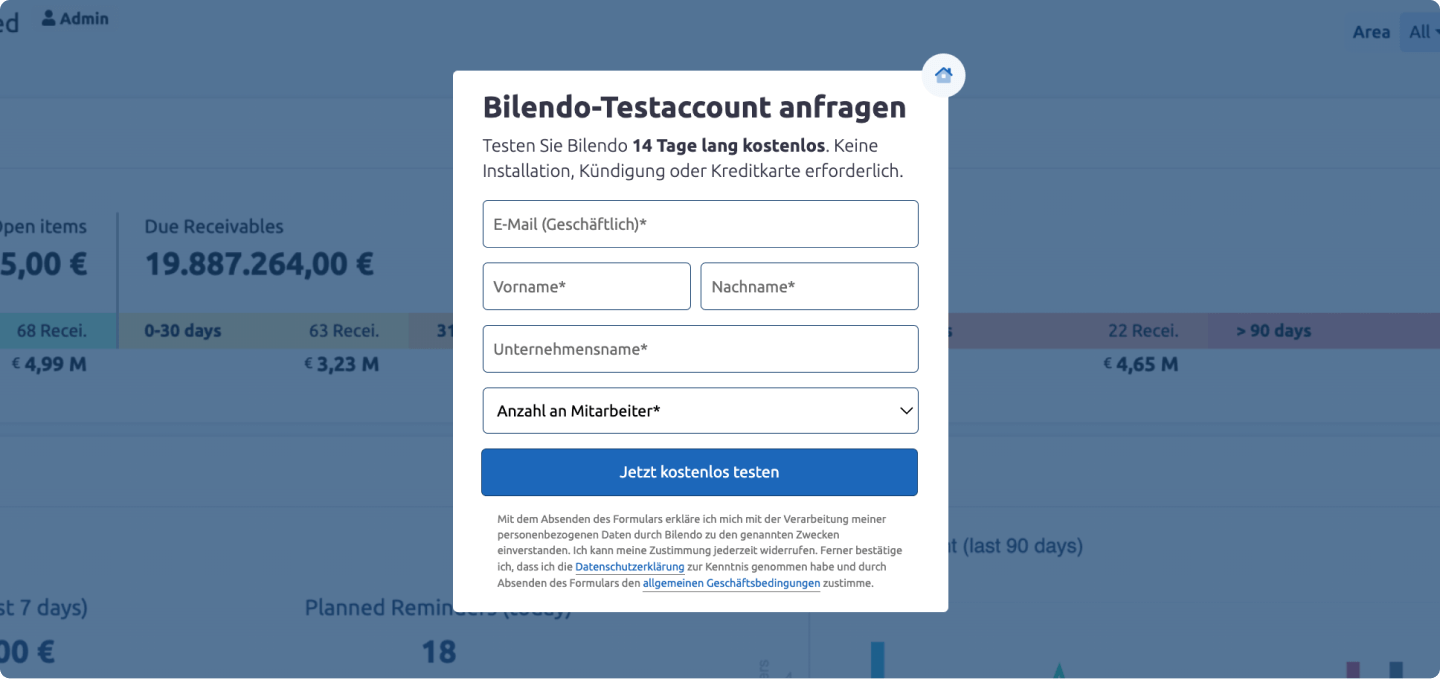
Custom modals
Showing customised Hubspot forms in modals to embrace the design and user exprience for software interaction steps.
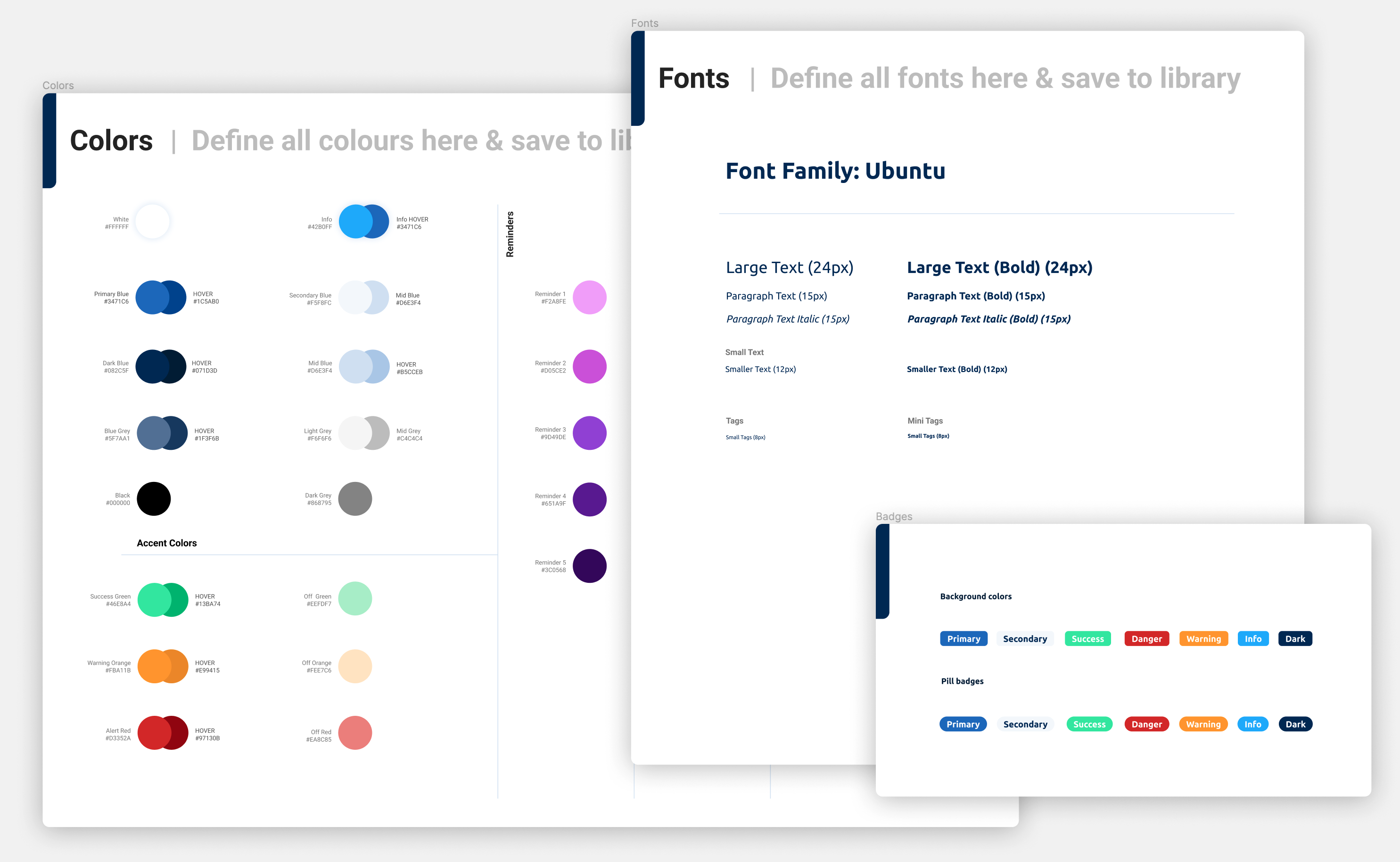
Crafting design system
Conceptualising and creating the frontend design system for the software in Figma.
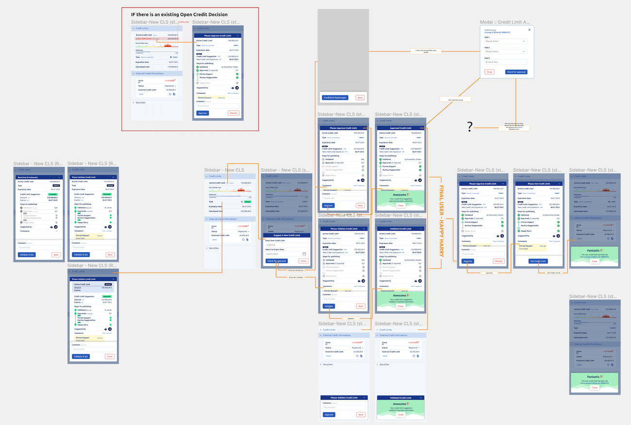
Wireframes to prototypes
Got to love Figma! Creating wireframes for concepts right through to prototypes and working with the end developers on details.
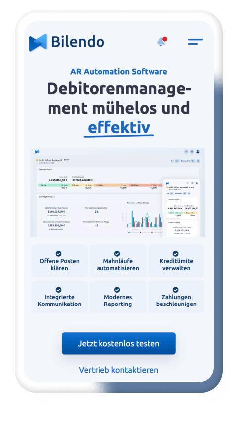
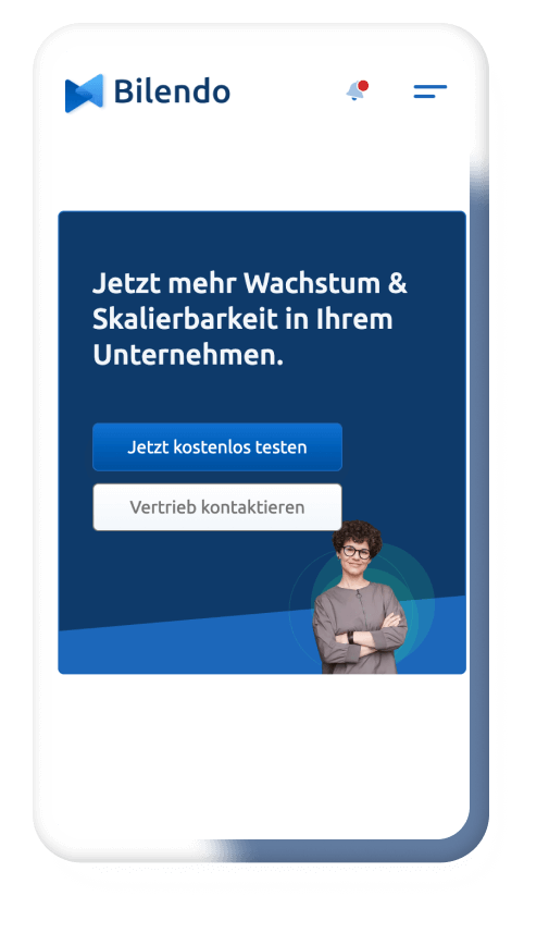
Responsive as always
Suitable customisations for various screen sizes - even if some German words are reeeeaally long.
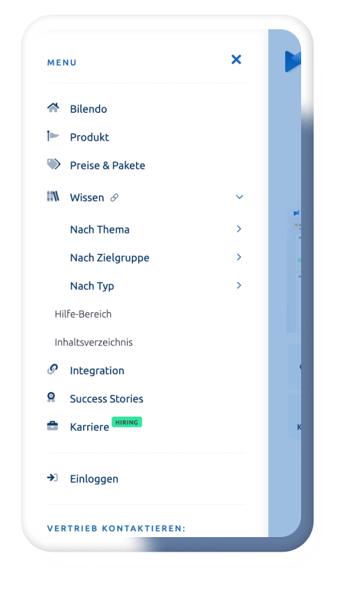
Customised mobile menu and UX
Mobile menu's should be fun too (and useful).
And banners to suit
All aspects customised to suit screens and usability.
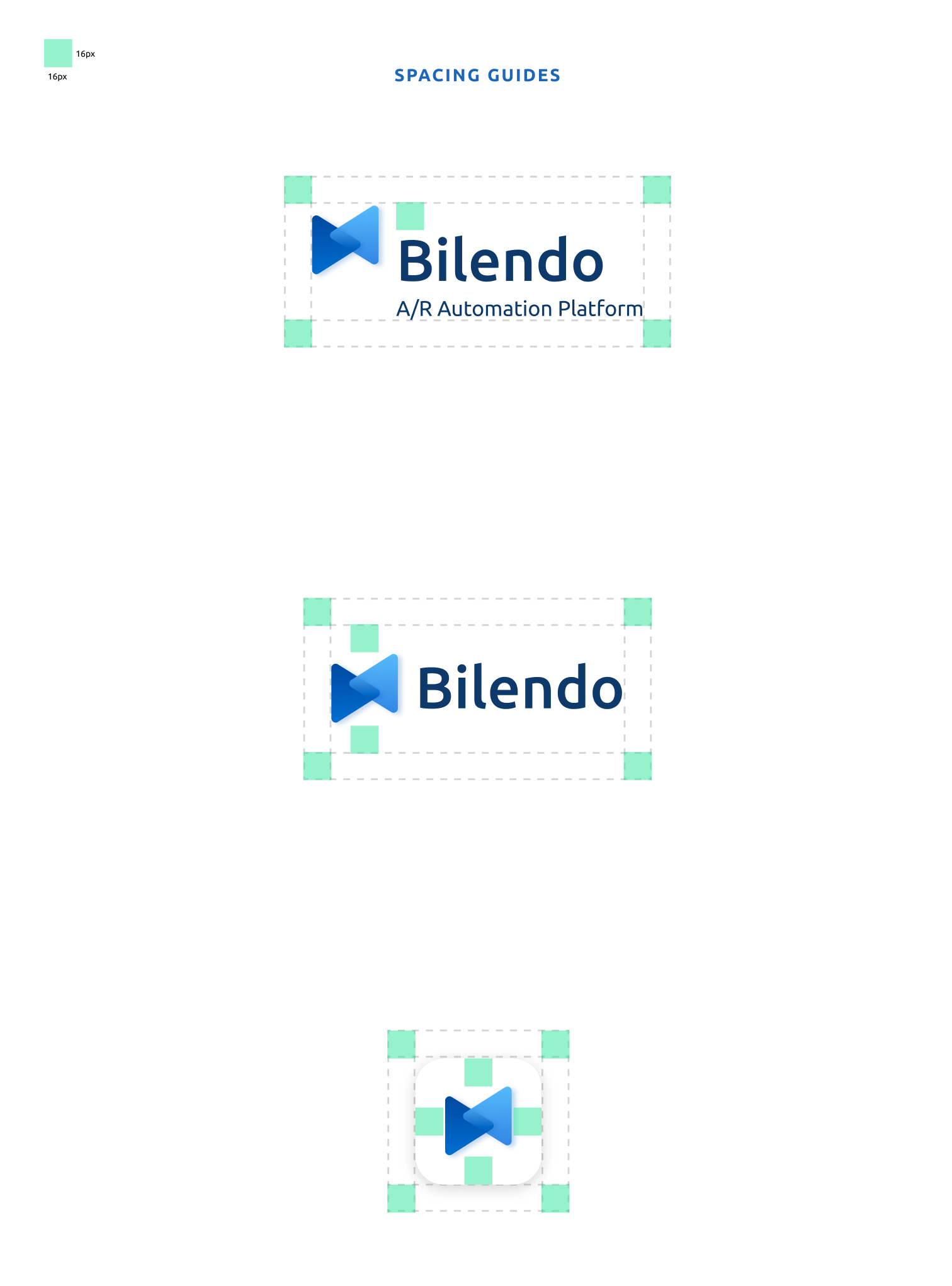
Logo construction
Finer detail logo creation and processing.
Platforms and tools
Some of the goodness we used to create and manage this project.

