New layout, design and development of the website for the best hair salon in Takaka.
Colovaria had been working on a rebrand and wanted to launch the new brand together with a new online presence in the form of a website.
We worked with Colovaria on some initial concepts to decide on the best approach. The goal of the final build was to bring through the brand and salon feel online, with a colourful but minimalistic layout.
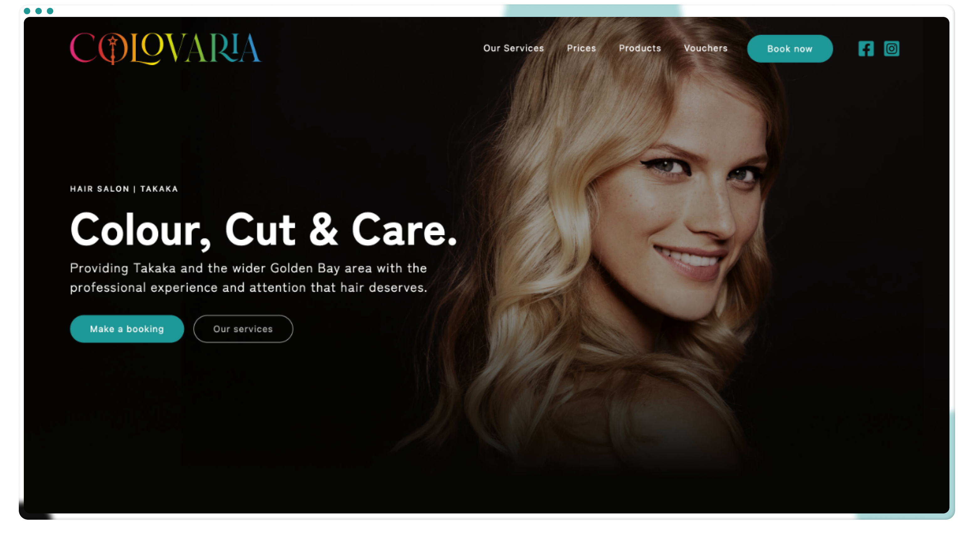
Product display
A unique way of displaying the products available through Colovaria.

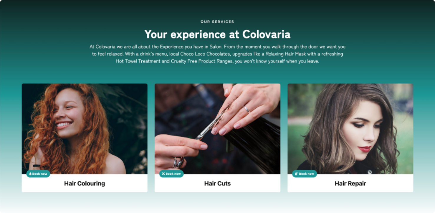
Helpful sections
Making it easy to do what you came for with booking links.
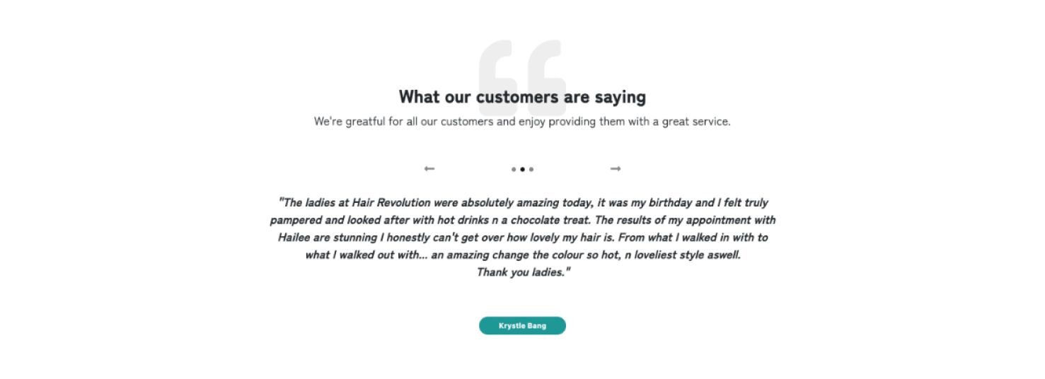
Building trust
Providing a display of references from current and past customers.
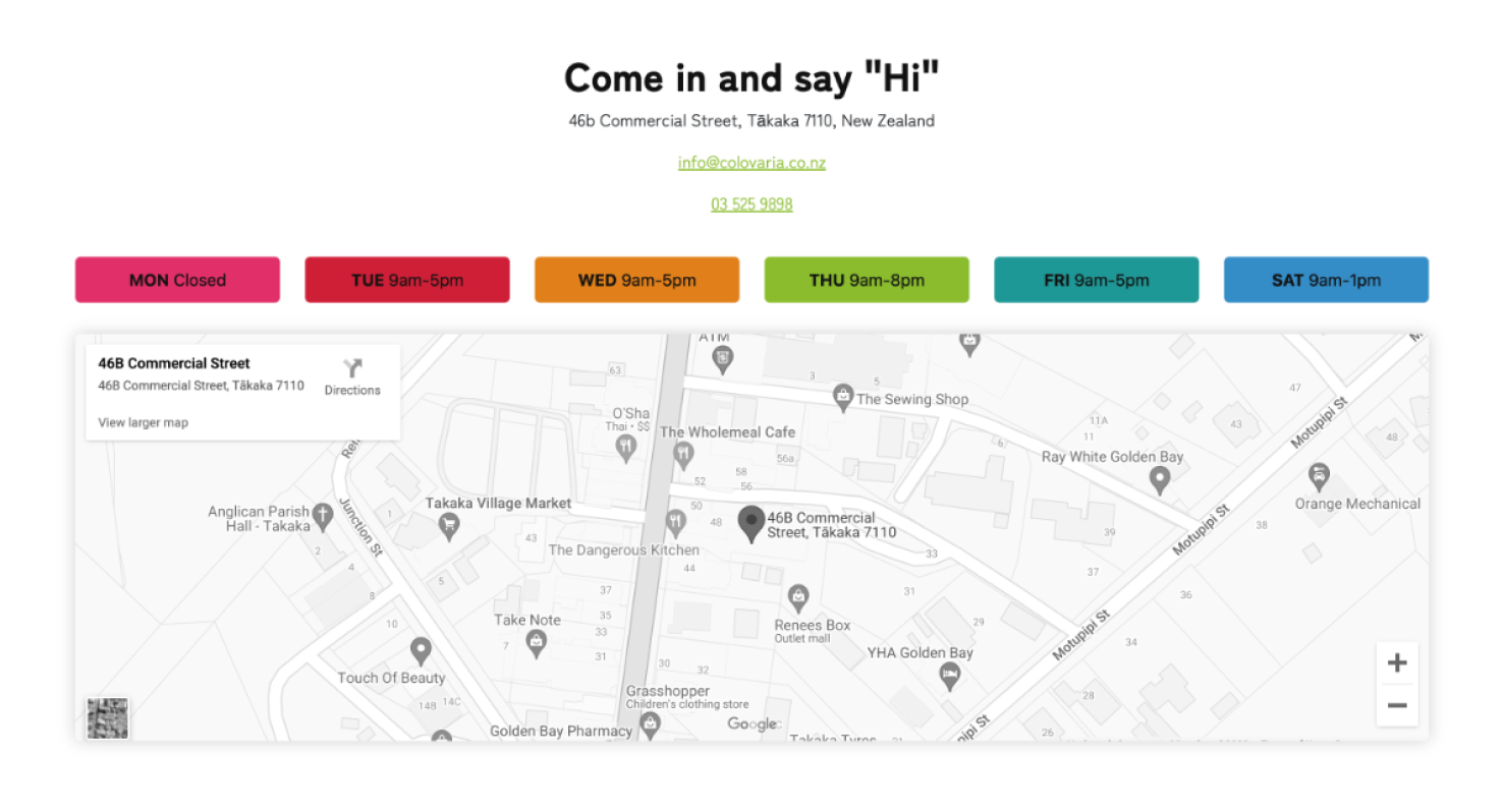
Easy contact options
Clean and clear display of contact options, hours and location.
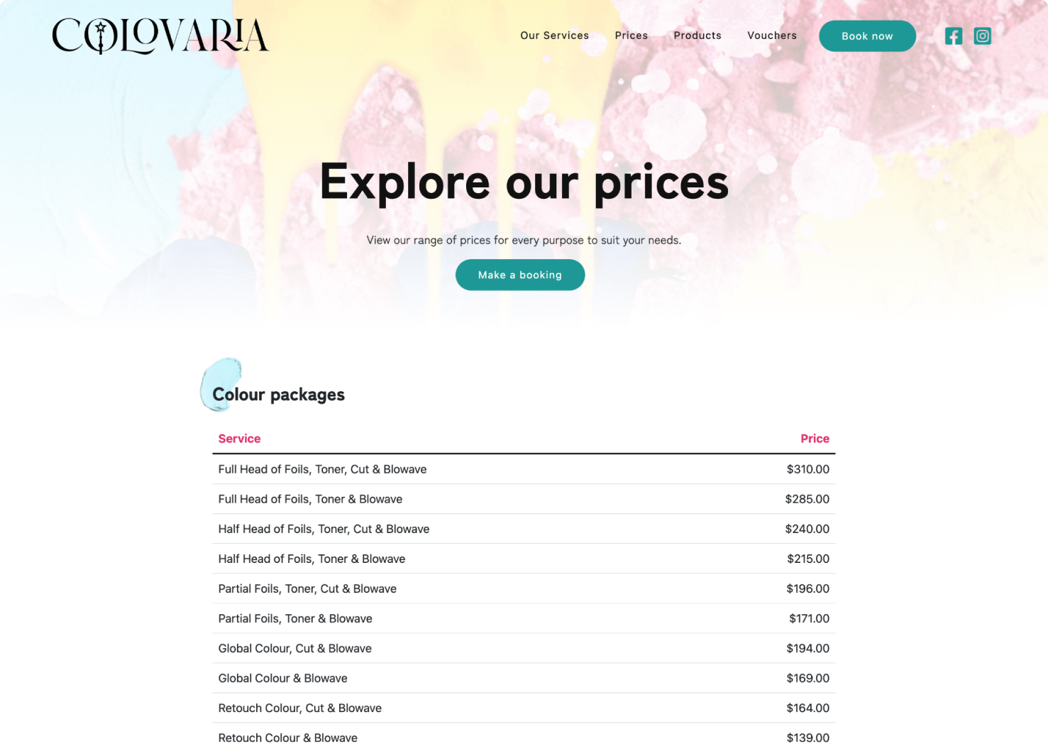
Pricing overview
Easy to follow pricing tables.
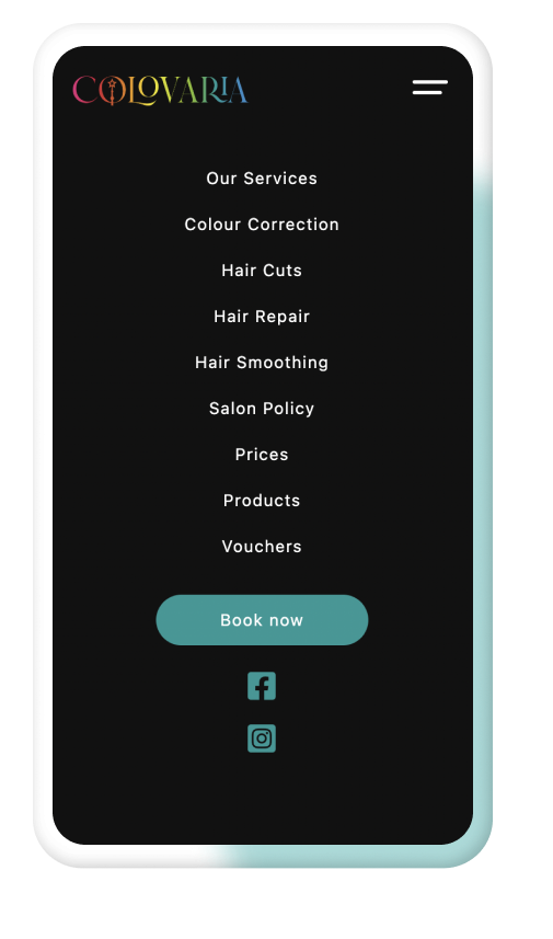
Mobile usability
A customised mobile menu.
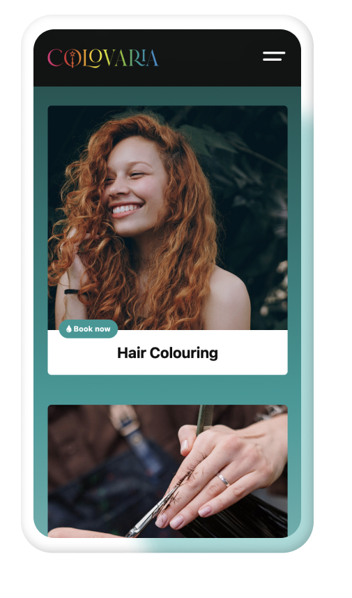
Everything responsive
Full layout customisations to suit any screen size.
Design context
Clean and clear was the focus. Easy to underrstand sections that are helpful for the user to navigate through and get to the desired location. Creating a the connection with the brand feel was important to make visitors feel comortable and taken care of.
Platforms and tools
Some of the goodness we used to create and manage this project.
